My Role & Responsibilities
-
Product design
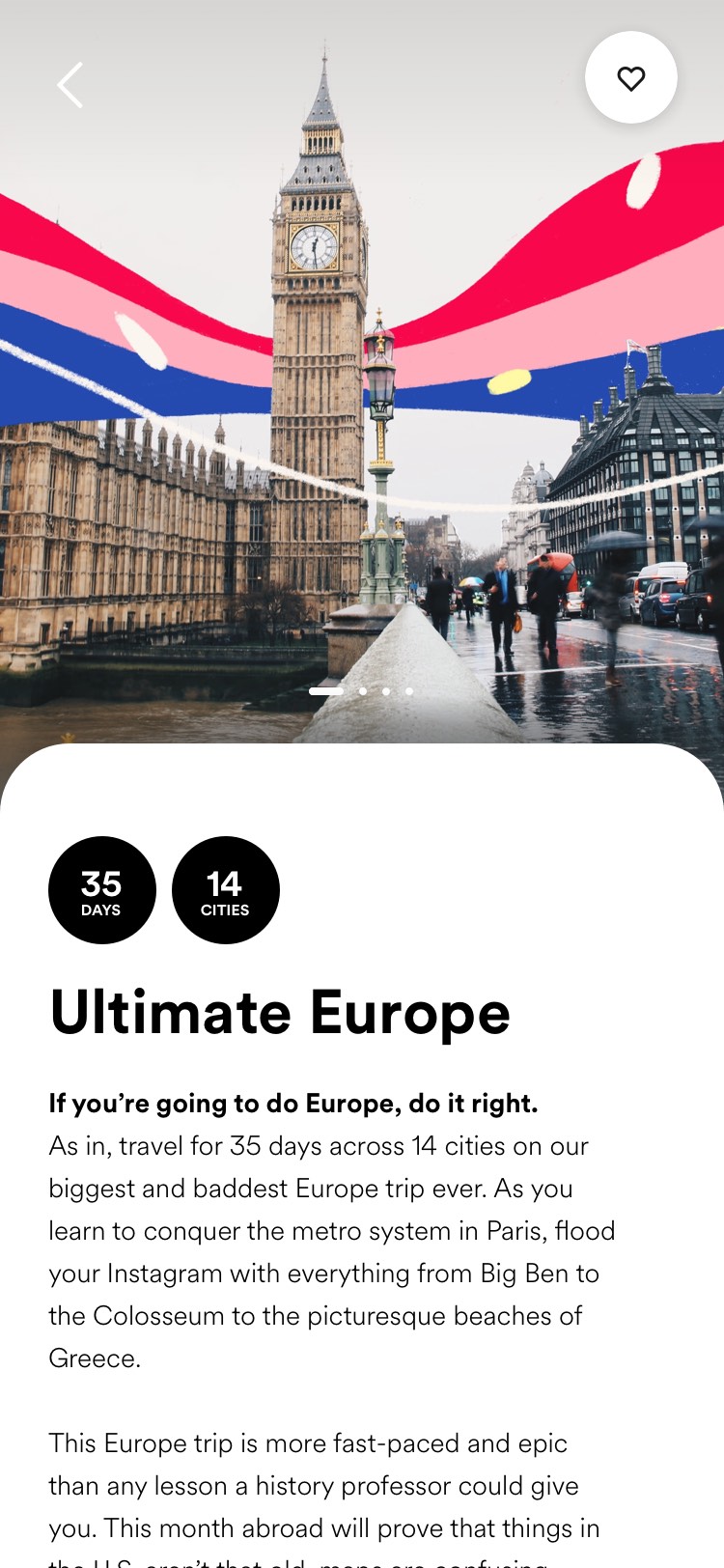
Background
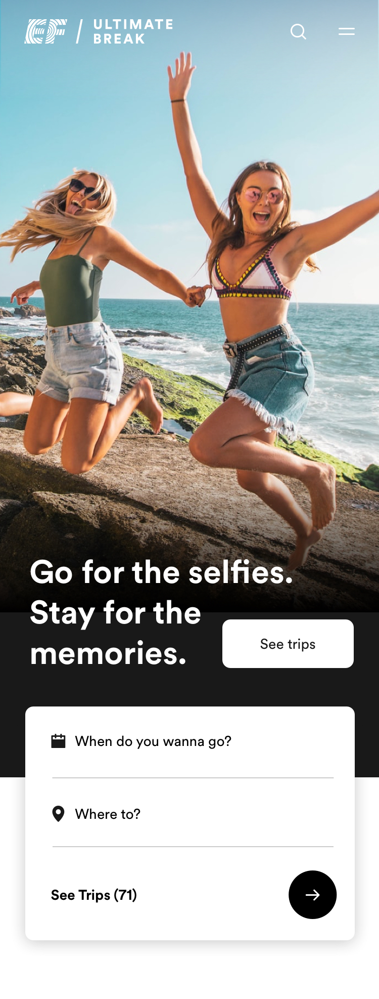
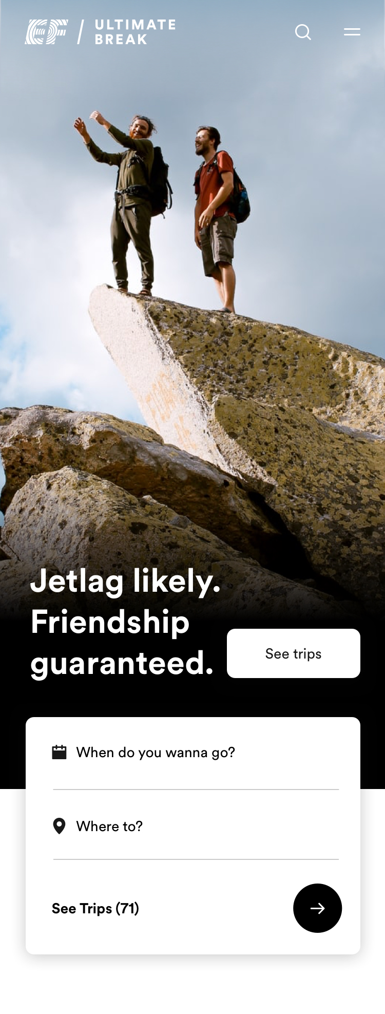
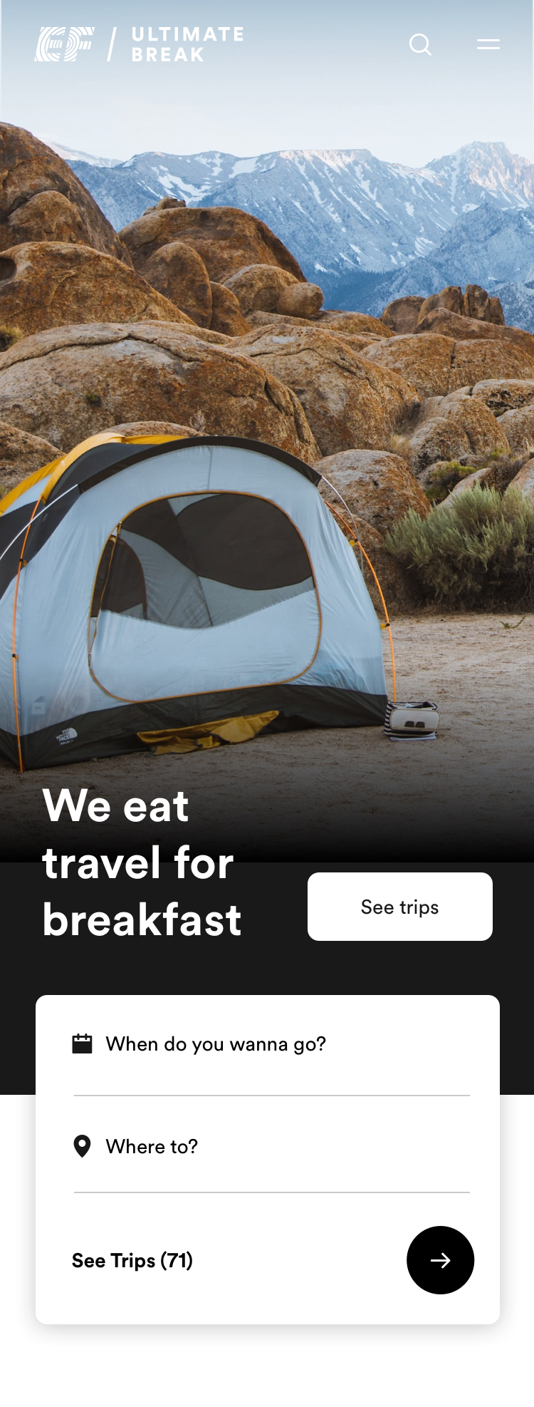
The current Ultimate Break site lacks an inspirational storytelling layer to evoke emotion and excitement around their trips. Todays messaging is primarily focused around promotional content.
The Design Process
The goal of the site is to make it easy to find and book the trip that is right for you. The user experience should:
-
Educate users about the product through a typical user journey
-
Give users tools to help them narrow down, explore and compare trips
-
Inject a storytelling/inspirational layer for those not ready to buy
All of this on mobile which accounts for 86% of all website traffic.
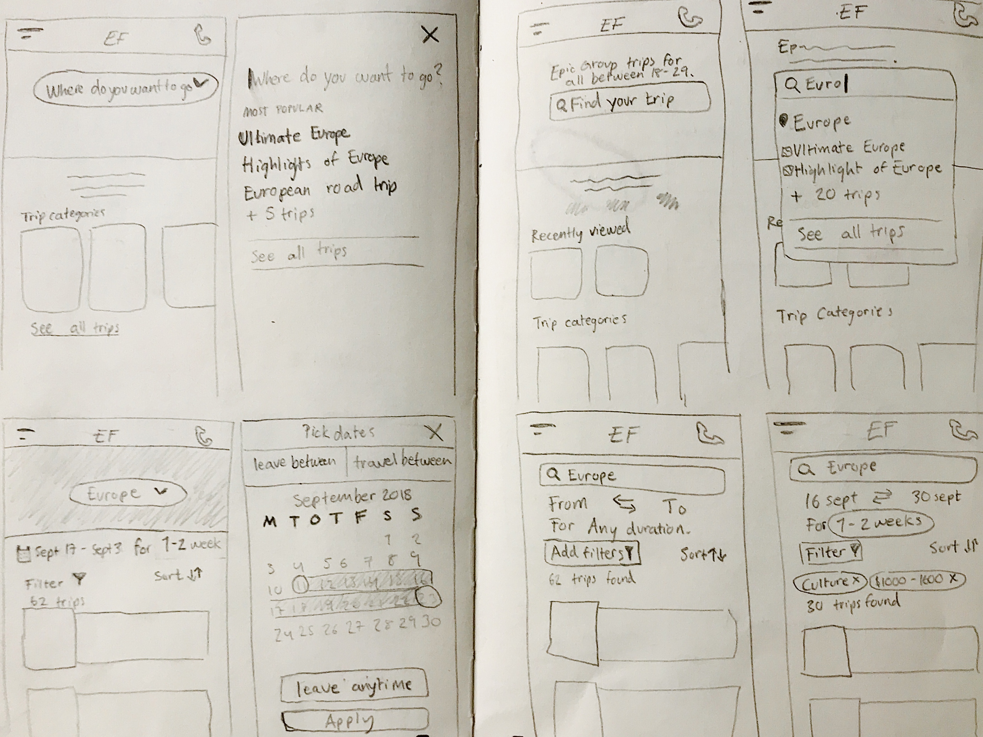
Trip Browsing behaviour
Users view an average of 40+ trips before booking. This implies that users need a convenient and easy way to browse trips on the site. Users need to be able to explore trips and quickly be able move between trips for comparision.
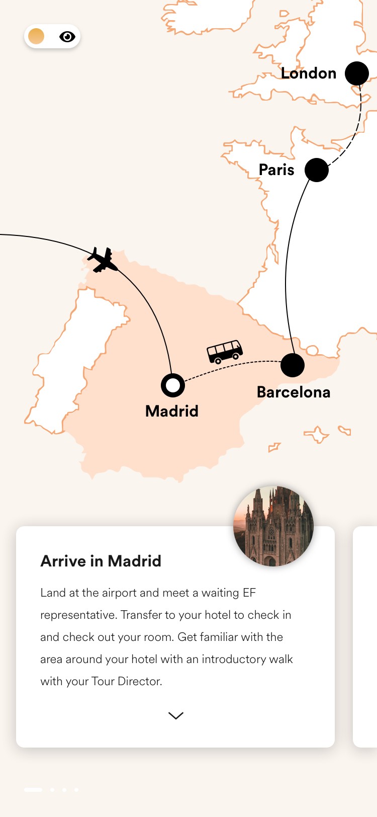
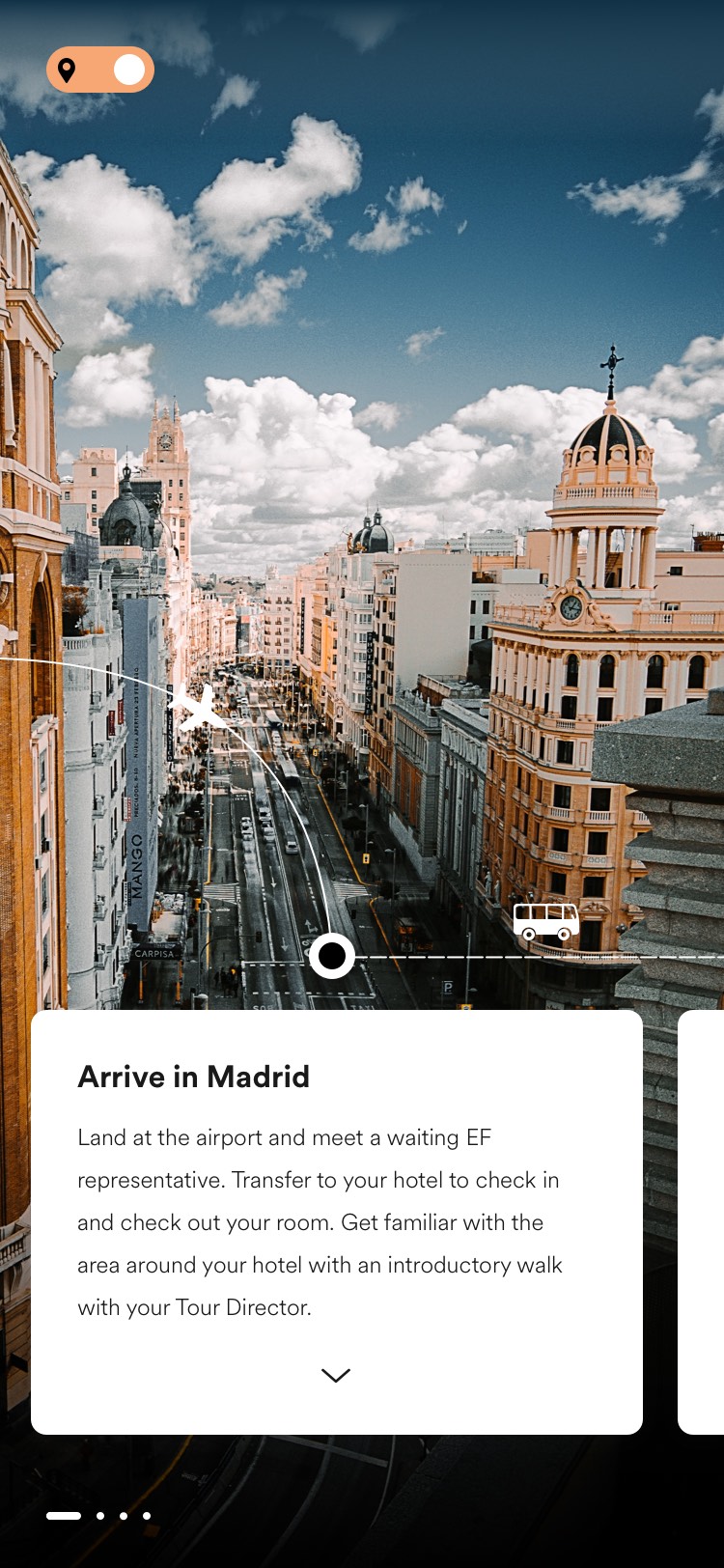
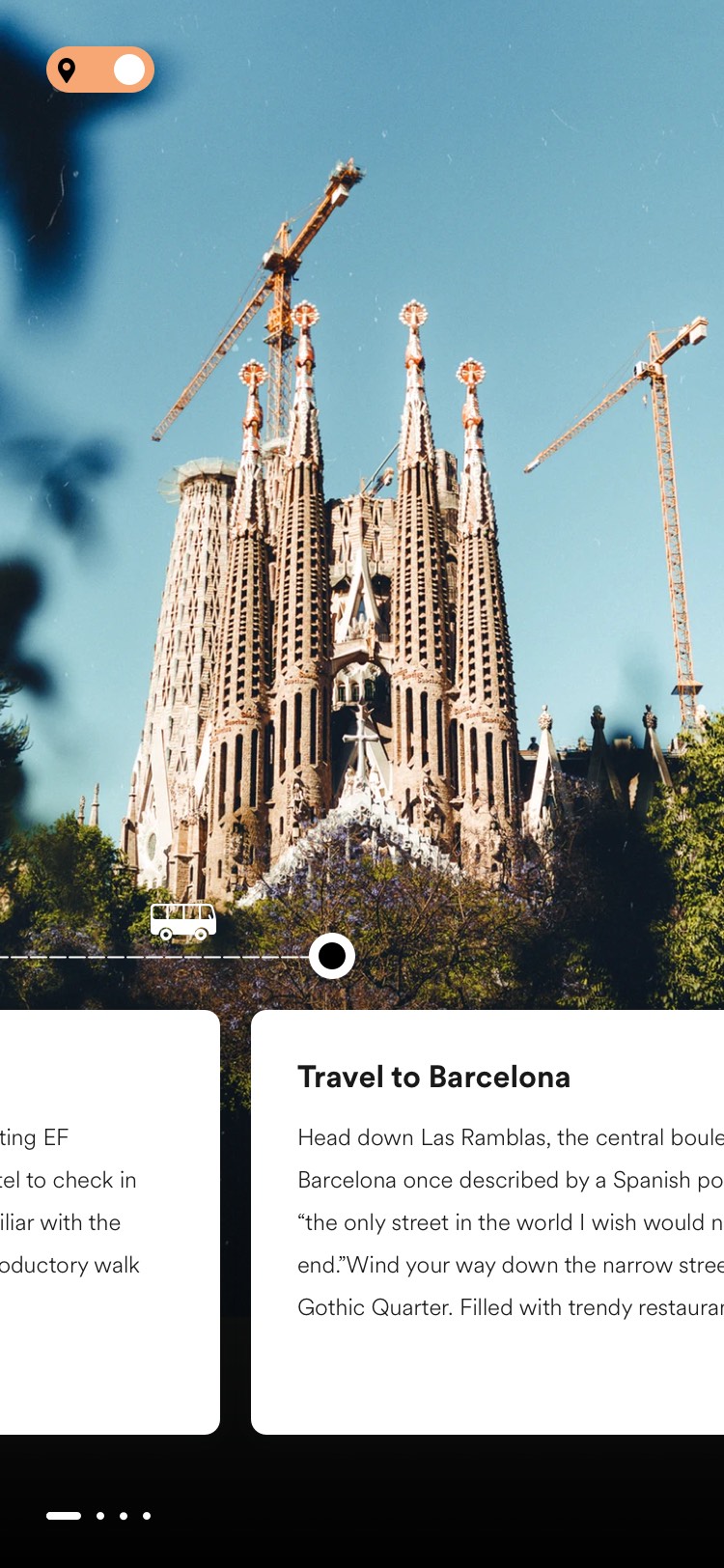
To solve this issue I explored having a map view that would allow users to swipe between different trips and see the trip route reflected. Users can then dive deeper into a specific trip and swipe through the itinerary to read more about what the trip includes. A top bar tells you what trip you are in and allows you to easily move back to exploring trips. Ontop of the map there are exposed filters to filter trips by continent, a search bar and a toggle that takes users to a list view of the trips.
Re-imagining the Trip Itinerary
The current Ultimate Break itinerary is a long document of text. Although it includes very detailed information that users loved, it is currently difficult for users to get an idea of a trip at a glance.
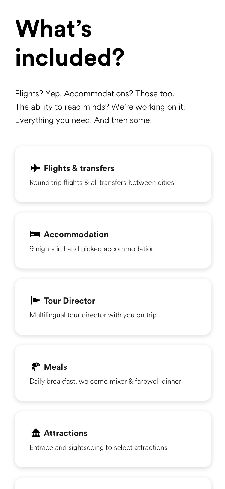
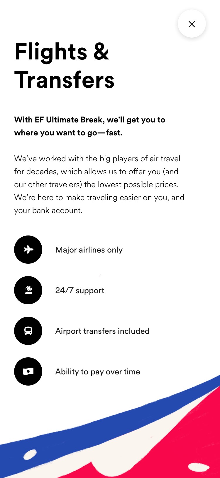
The itinerary should give users an overview of a trip and its highlights on a scan, but also allow users to dig into details and get more information if they wish. Inspirational and immersive content needs to be balanced with information in a digestible manner, to accommodate for users who know nothing about Ultimate Break and a trip as well as those who are ready to book.
An interactive itinerary map lets users experience the route as they would on the trip. Organising itinerary content based on destinations instead of days gives users a better overview and allows them to quickly navigate to the places of their interest.
Exploring an improved booking flow
As with every booking flow, the goal is to make the experience as seamless as possible. To improve Ultimate Break’s current booking flow I considered how the flow could be broken down into steps to become a more user friendly and smooth experience.
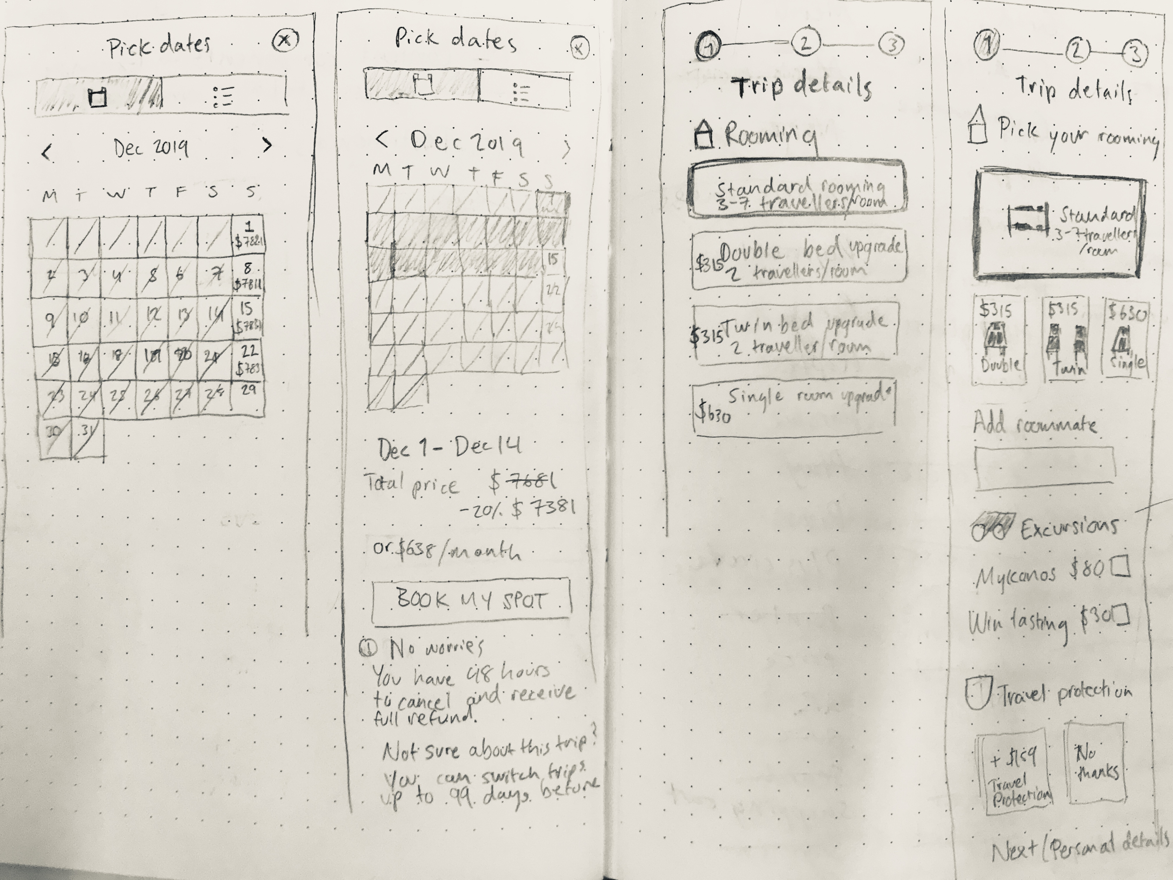
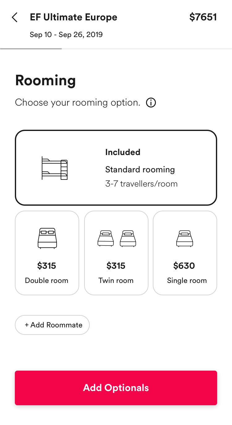
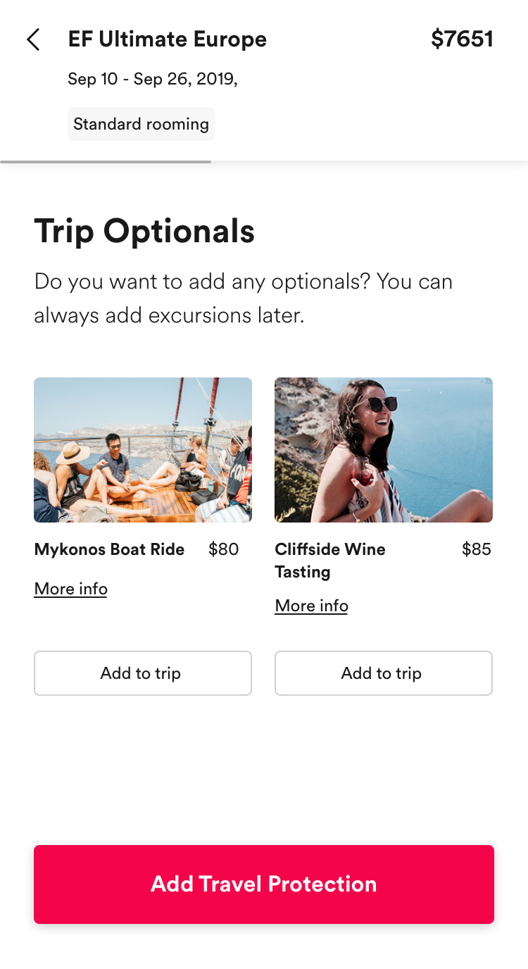
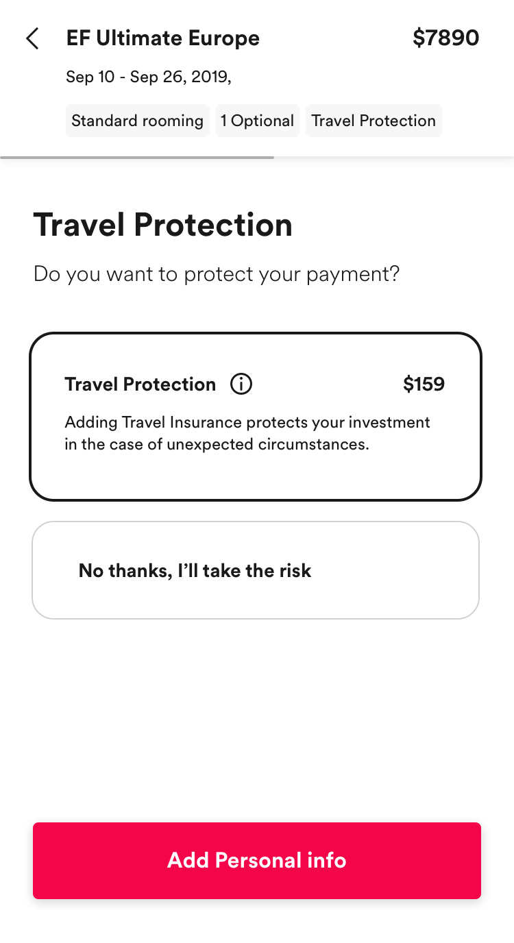
The top bar of the booking flow displays the trip info, add-ons and price. As users navigate through the flow they can see how their selections modify the price and are added to the top bar. If users want to adjust any of their selections they can easily do so by selecting the element they wish to change in the top bar -taking them back to the specific step.